
Year 2024
Duration 13 weeks
Project type Group project, University of Sydney, Desktop app
Tools Balsamiq, Figjam, Figma
View PrototypeProject Overview As part of my Interface Design course, this project challenged us to enhance an experience tied to one of Sydney’s iconic public events. My group chose City2Surf, focusing on boosting community engagement. As a result, we designed a multi-platform experience—mobile, watch, and desktop—with features to help our user persona plan her race, find friends during the event, and easily share post-race photos. I was responsible for the desktop experience.
My Role The research and ideation process was collaborative—our team conducted online ethnography, developed user personas, and used the Jobs-to-Be-Done framework to create a journey map. Each member then took ownership of a specific device and user flow. I focused on the desktop experience, specifically the post-race flow, where I designed the user’s journey of purchasing event photos. To refine the desktop design, I applied Heuristic Evaluation and conducted usability testing.
City2Surf has been around for over 50 years, and has had more than 85,000 participants run it from all across the globe. It is not only about fitness and fun, but also about raising funds for a good cause, and being a part of the larger community. It is through participatory sporting events like this, that people generate substantial social value and positive social outcomes in the local community, not only among participants, but also spectators and volunteers (Zhou & Kaplanidou, 2018).
After all, for communities to flourish, families must feel safe, secure, accepted and included (Booth & Cameron, 2020). This includes both parents as well as children who will benefit from not only understanding more about their culture but foster their sense of belonging.
We conducted an online ethnography, exploring Reddit and Facebook to understand parents' perspectives, while using Instagram and TikTok to gain insights into the views of younger kids and teenagers.

This led us to identify 3 main groups of users:
Parents of young kids go to great lengths to ensure their children feel included, making extensive preparations to make sure the whole family can enjoy the event together
Kids (age 6-12) who run the City2Surf tend to be highly motivated and inspired to take up running from their parents’ own active lifestyles
Older kids (teens) have started running with friends rather than family members, and are more greatly influenced by social media
While the findings about parents and young kids weren’t surprising, the clear shift we saw with teens was really interesting. From there, we moved on to the next step.
Now that we've gainined a better understanding of the City2Surf community space, we moved on to define whose problem we wanted to solve and what specific issue to address. Considering the assignment's constraints—that each member would focus on a different part of the user journey and device—we made our decisions accordingly.
We began with creating user personas based on our three identified user groups:
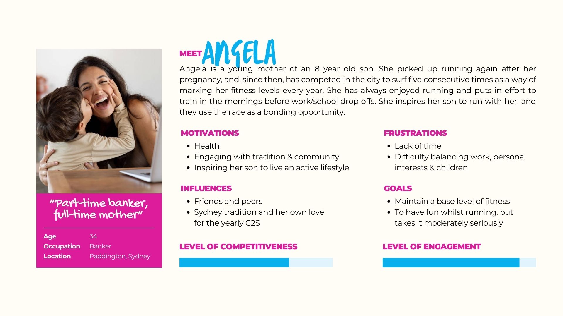


These 3 user personas not only helped us empthatize with our potential users better but also helped inform the next step of our process which is prioritizing the jobs-to-be-done.
Using user personas and the Jobs-to-Be-Done framework, we identified and ranked high-level goals for each user, narrowing them down to the top two statements. Although children's safety for parents ranked highest in importance and opportunity, we ultimately selected the second-highest statement as it better aligned with the project constraints of requiring an app and effectively integrating all three devices.

We then created Maxine's detailed user journey map to visualize her pre-, during-, and post-journey activities and touchpoints as she completes her job.

Our final How Might We statment:
"HMW enhance the social interaction for teenage participants through mobile, smartwatch, and desktop applications?"
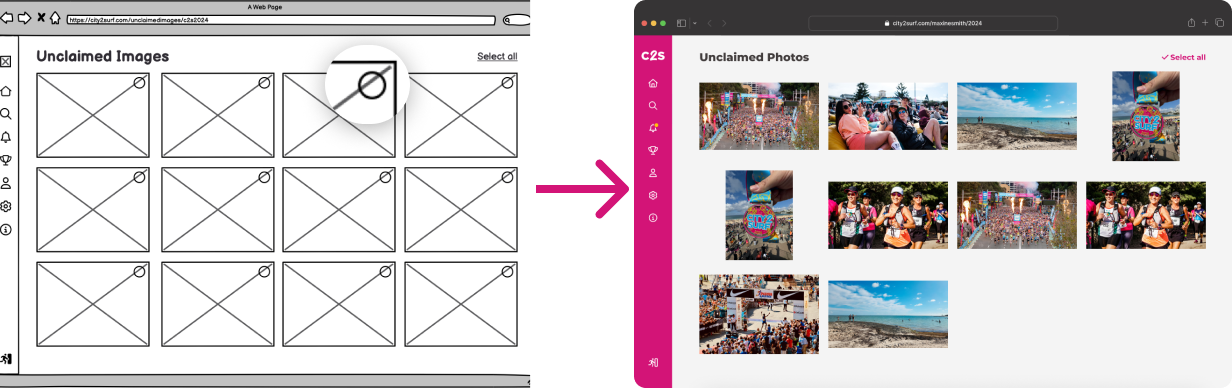
At this stage, each member began taking charge of each part of the user journey and began crafting their individual solutions. Starting from hand sketched wireframes to low fidelity prototype to high fidelity prototype. My part was in doing Maxine's post-journey flow using Desktop.
To enhance the experience for teenage participants like Maxine, whose primary motivations are social connection and sharing memorable moments on social media, my solution for her post-journey user flow focuses on two key features:
I also needed to craft a user flow to make sure the solution translated well into a product and this process proved to be challenging. It was important that the information architecture made sense so I designed and experimented with many configurations.

Exploring the idea of redesigning the mobile sidebar and adapting it for desktop helped bring everything together.

I finally created the lofi-prototype using Balsamiq and this is how it went:

Before delivering the final results, I went through two more rounds of feedback and testing. The first round focused on the Creative Director's feedback on the lo-fi prototype, which led to changes in the first iteration of the high-fidelity version. Meanwhile, the second round involved an independent Heuristic Evaluation and Usability Test on the high-fidelity prototype itself.
Below are the consolidated list of revisions from the Creative Director's feedback and further explorations:

⚠️ Issue
🛠️ Solution
⚠️ Issue
🛠️ Solution

⚠️ Issue
🛠️ Solution

⚠️ Issue
🛠️ Solution
Usually, this would be where I show the final results... But this time, I have 1 more round of testing to go.
A heuristic evaluation based on Nielsen (1994) was used to identify the strengths and points for improvement throughout the entire app.
Afterwards I also conducted a usability testing on 3 users with 8 different tasks.
The results are as follows:
So of course I needed to fix these too!

⚠️ Issue
🛠️ Solution

⚠️ Issue
🛠️ Solution

⚠️ Issue
🛠️ Solution

⚠️ Issue
🛠️ Solution

⚠️ Issue
🛠️ Solution

⚠️ Issue
🛠️ Solution
After implementing those changes was I now finally ready to submit the final outcome!


What I learnt, what I would have done differently, and where I go from here.
Since this project was part of a classroom assignment, many of the methods we used were predetermined, and the device constraints—requiring us to use mobile, smartwatch, and desktop—proved to be limiting. With more flexibility, I would have conducted user interviews to better refine the app concept. I also realize that the best solution might not have required all three devices. Working outside those constraints could have led to a more focused and practical outcome.
The last time I worked on an end-to-end design project was years ago, when my technical skills were limited. With three years of experience, I’m now proficient in Figma and prototyping, including microanimations and detailed transitions, which better represent the final product. This improvement also earned positive feedback from my tutors. I was able to focus more on exploring ideas without technical constraints, leading to a more thoughtful UIUX design.


