
Year 2020
Duration 6 weeks
Project type Group project, Apple Developer Academy, iOS Native App
Tools Sketch, Marvel, Adobe Illustrator
Project Overview Lilyst was created during a group challenge focused on solving real-world problems. From a list of prompts, our team chose to explore elderly care. Although I didn’t have firsthand experience, my teammates did—giving me the chance to build empathy and design with real user needs in mind. The result was Lilyst, a native iOS app designed to streamline family care coordination.
My Role I worked as half of the design team, with me focusing primarily on the mobile app. Additionally, I was responsible for planning and conducting usability testing, which involved creating tasks, setting up prototypes, recruiting participants, scheduling sessions, delegating tasks, and compiling the results.
Many elderly individuals have lost physical functions, making even simple tasks potentially hazardous for them. As a result, family members especially in Asian households where the family culture is held highly, will care for them. But this responsibility tends to be unevenly spread between family members, with one family member typically serving as the primary caregiver, and other members supporting them.
rate their work as highly stressful
report high levels of physical strain
Furthermore, interviews revealed that many caregivers work alone and don’t receive consistent support from other family members. However, this is often not due to a lack of willingness but rather a lack of understanding about how to help or what the primary caregiver and the elderly truly need.

Because of this, we came up with this final app statement:
A native iOS App that helps coordinate elderly care between family caregivers. This is done by allowing them to monitor and input the elderly's information & needs, also share this information with other family members.
This is a solution to the challenge because when all the family are better informed about what the elderly needs, they are able to participate more actively in fulfilling said needs.
Just because we had settled on the app idea didn’t mean we immediately knew how it would work. At this stage, each team member had a slightly different vision for the final app’s look and functionality. We needed to bring all our ideas to the drawing board, prioritize them together, and align on a shared vision to move forward.
From our interviews, we created our user persona, Lisa, who is a primary caregiver in her family.

We created user stories from her perspective to identify the features she would find useful...

...and then used the Impact / Effort Matrix to prioritize them.
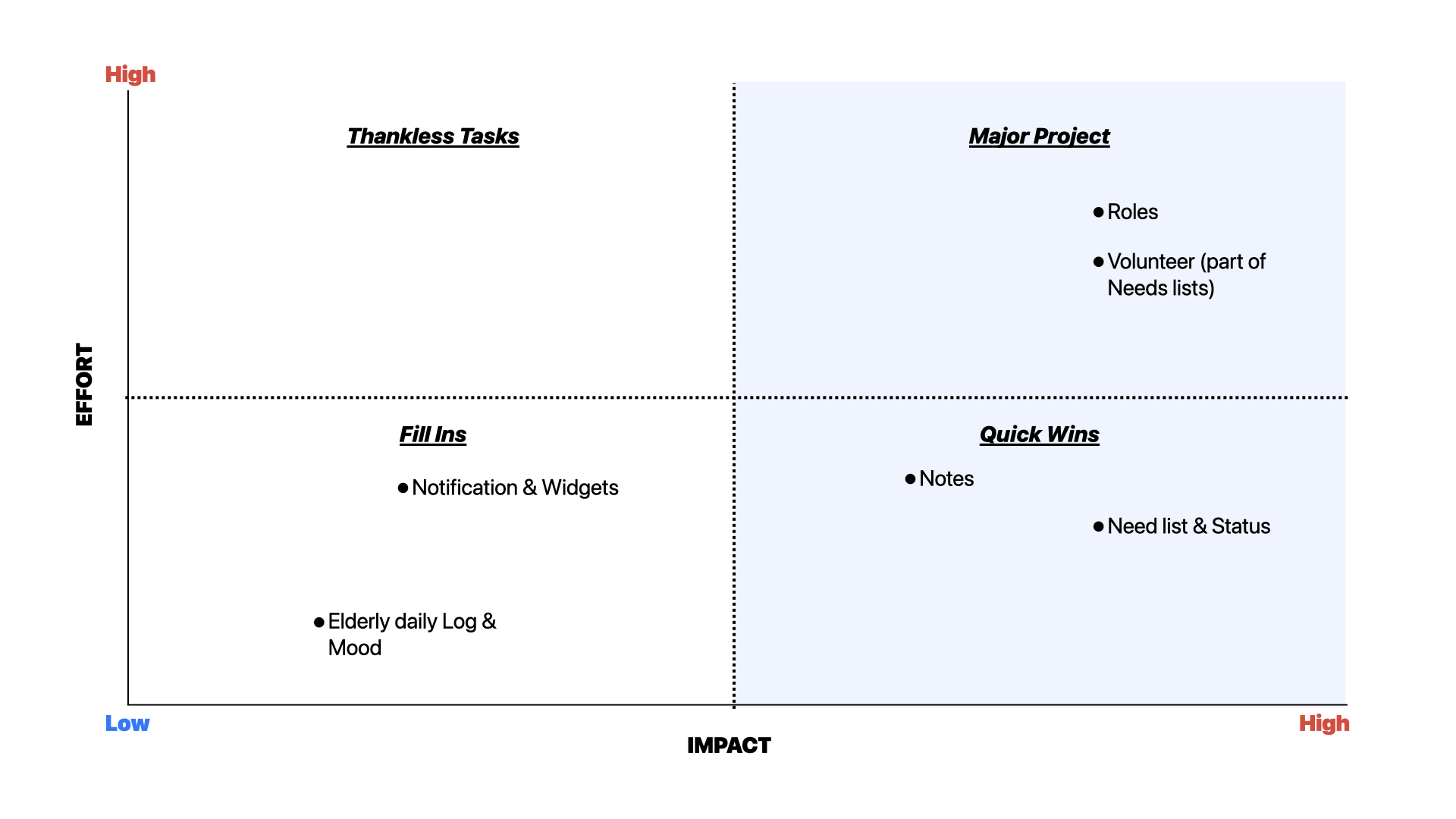
This helped us come up with our first low fidelity prototype focussing on the "Need list" (Which we've renamed to "To-Do-List" in this version) and "Volunteer" feature which is demonstrated from her brother's point of view. The prototype also included the "Notes" feature, though it felt somewhat disconnected from the other functionalities at this stage.

We used this feedback to guide our decisions in the next design stage. While we considered all input with an open mind, we also had to be selective about what to implement.
For example, considering the diverse needs of different families helped us think more carefully about how to categorize the Notes and addressing varying literacy levels of family members led us to prioritize accessibility. However, while the idea of enabling automatic sharing to other platforms was promising, we decided it wasn’t a priority at this stage.
The final designs before heading towards the usability testing is as follows:

I was happy to take on the responsibility of coordinating usability testing while my groupmates focused on branding and development. Although it was a new experience, my love for organizing tasks and checking things off lists made it a natural fit. It was also exciting to gather genuine feedback from people experiencing our designs for the first time.
It was important for me to create a list of tasks that thoroughly covered all the features we wanted to test. I aimed to make each task challenging enough to yield meaningful insights without being overly complex or addressing too many decision points at once. To provide better context for testers, I also framed each task within a narrative, helping them understand the purpose behind their actions.

I designed a digital poster to spread the word and created a link for potential testers to fill. Our screening criteria focused on individuals with experience caring for elderly or sick family members, those with multiple family members involved in caregiving, and iPhone users. This process allowed us to recruit five testers who closely matched our user persona.

Once I had scheduled the interview times with all the participants, I split the interview and note-taking duties between myself and my group. To keep things consistent, we worked from a pre-written script I had put together. This way, everyone could experience both roles and get a feel for the usability testing process. Since this was during the pandemic, we conducted the sessions online using Marvel, and we encouraged participants to think out loud, which added a valuable layer of insight.

Finally the results were compiled together:

Although none of the tasks were failed, there were some tasks where users only partially succeeded—completing some, but not all, of the success indicators.
We also saw plenty of what we called “indirect successes,” where users managed to complete the task and tick off all the success indicators, but took a roundabout or unexpected path to get there. These moments gave us valuable insights into how real users might interact with the app in ways we hadn’t anticipated.
Using these data and insights from post-testing interviews, we identified several key problems in our app:
Based on those results, we continued to iterate on the design:

1.
Properly labelled the Task Category and grouped it together with other Task Information according to the Gestalt principle of similarity.
2.
Included the number of volunteers who had already signed up instead of showing only the number of volunteers needed.
3.
Relabelled button as "Be a volunteer for this task" to reduce ambiguity and serve as call-to-action. Furthermore, clicking this button will now trigger a success toast notification.
4.
Replaced the "[Back to] Create Task" button to a less ambiguous "Done."
5.
Added function to add new Note within the "Attach Notes" function.
6.
Changed the Medication icon with a more easily understood Pill shaped one.


7.
Moved the "Generate Care Code" function into "Team Members."
The final look:


What I learnt, what I would have done differently, and where I go from here.
Through this project, I realized how much I enjoy learning and how flexible I can be as a designer. Even though I started with little knowledge about elderly care, I found myself deeply engaged in the topic. It showed me how much I thrive on diving into new subjects and adapting to different challenges.
This was my first experience conducting usability testing on a product I designed, and while I learned a lot, I now see where I could’ve improved. I focused mostly on the feedback users explicitly shared, but looking back at the notes, I wish I had paid more attention to what wasn’t being said. If I could revisit this project, I’d use an affinity diagram to better organize our findings and uncover unspoken patterns we might have overlooked.
If I were to continue this project, I’d also conduct another round of usability testing to evaluate how the design changes have influenced task success rates. I’d also refine the task list to ensure each task were more focused, making it easier to analyze results and gain more accurate insights.


