
Year 2021
Duration 5 weeks
Project type Solo project, Freelance
Tools Figma, Adobe Illustrator, Photoshop
Project Overview Nona Woman set out to create a period tracking app for Indonesian women, combining social features, analytics, and e-commerce. While they had a strong vision for the product, they needed support in crafting a cohesive user experience—that’s where I came in. The result was a complete app design that brought their vision to life in a seamless, user-centered experience.
My Role As the only freelance designer on the project, I took on competitor research, designed user flows and screens, and made sure Nona's brand identity was integrated throughout. I worked closely with the founders and developers to prioritize MVP features and created reusable design components to support future growth.
At the beginning of the project, the Nona Woman team provided me with a list of key competitors, which I spent the next few days exploring. Since I was new to these apps, this deep dive gave me the chance to step into our users' shoes and understand what would make Nona Woman stand out.
I focused the analysis on the features the client wanted to integrate into the app and it immediately stood out to me that none of the current apps were as all-encompassing and holistic as Nona set out to be. Flo comes closest, but even it lacks the crucial BBT tracker and detailed analytics that only Kindara offers. Furthermore, Nona's plan to integrate e-commerce plays into their strength as a producer of women’s health products which creates an additional unique selling point over other competitors.

Other key takeaways that I gathered from this process includes:
Among the three, Flo’s design stands out as the most modern and polished, offering an interface that feels intuitive and up-to-date. In comparison, MyFlo and Kindara, while functional, feature more outdated interfaces that can feel less refined and harder to navigate.
Flo is a versatile period tracker for casual users, while MyFlo and Kindara are targetted towards more expert and extreme users. This leaves a market gap for Nona to fill as a modern app that combines expertise and precision while still catering to mainstream audiences.
Even though we were building an MVP, it was essential to set a clear direction early on and work closely with the development team to lay a strong foundation for future growth. After wrapping up the research phase, my priority shifted to shaping the app’s core structure—mapping out how features connect, how users navigate, and how everything functions together to create a seamless experience. The aim was to establish a natural flow across the app, setting the stage for all future developments.

...but they don’t always translate well into client presentations. I used these initial sketches to guide my questions around the product’s technical details, ensuring that my design not only looks great but also adheres to technical constraints.
Through further refinement, I developed two main alternatives that explore how the different features interconnect. It was the most important to us that all of the features were located in places that users can easily find, navigate to, and explore, aligning with our goal of catering to a wide mainstream audience.


These feedbacks led me to further iterations, where I explored the best placement for the "Resources" feature and how it could relate to the "Community" feature:


Finally, Alternative 3 was chosen, and we were ready to move forward with the next step. With just one month left to complete the remaining designs, I knew I had to work quickly and efficiently.
Moving on to the visual design of the Nona app, it was important to establish new design system that matched the Nona brand. This included being faithful to their established color schemes, guidelines, and typography. Some highlights of the design process include the following.
The "Home" screen of the Nona app went through several iterations. As the first point of contact for users, I knew it had to be perfect. Initially, I used a monochromatic palette to align with Nona's original branding, but after further discussions, I introduced a bright blue and yellow color scheme to bring in the playful touch it was missing. This key screen ultimately became our main reference for the visual design of all the other screens.

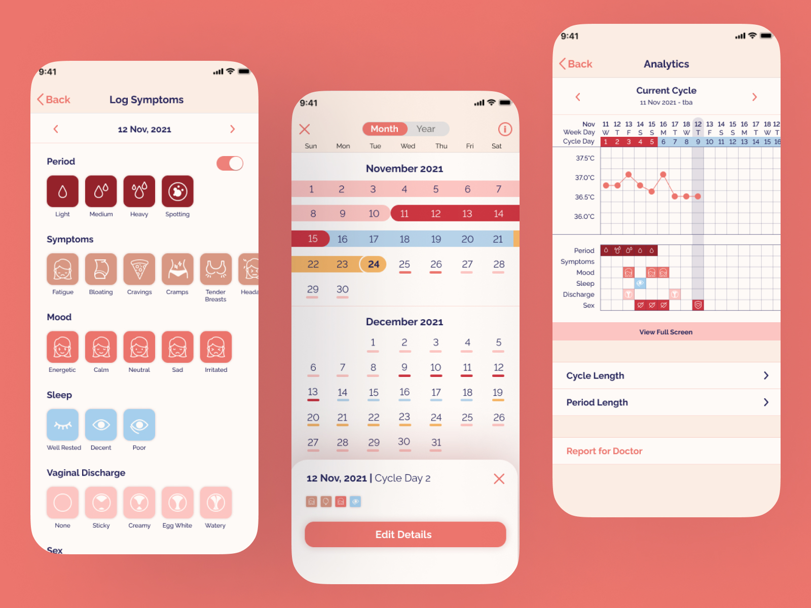
The symptom tracker was also crucial, as it’s a must-have feature for any period app. Ensuring it felt familiar and easy to use was key. The icon design was particularly challenging because no existing library had exactly what we needed. So, I decided to step out of my comfort zone and design the icons myself. It was definitely difficult as I had limited experience in the area, but it was so rewarding to see the clients happy with the final result.
Finally, one of the main selling points of the Nona app was its extensive analytics, designed to help users easily visualize their progress and body condition throughout the month. However, designing these features for mobile presented challenges due to limited screen space. To address this, the client and I decided to incorporate a horizontal full-screen version of the graph, providing a better way to display and navigate the dense information.

With that said, here are the final designs!


What I learnt, what I would have done differently, and where I go from here.
Throughout this project, I learned about working with branding constraints in UI/UX design. While I put significant thought into it at the time, I now realize there were inconsistencies in my approach. For instance, I used the same set of colors to code both phases and symptoms, which could lead to confusion. If I were to revisit this project, I would propose creating a derivative color palette based on their branding, ensuring it was consistent to its branding but also suited to its use.
When developing Nona’s design system, I was also still new to Figma and had mainly worked on iOS native apps. My experience with creating design systems was limited, so many components were basic and lacked proper documentation. If I revisited this project now with my current level of technical skills, I’d use Figma’s components and variants to build a more robust system, ensuring it’s easy for future designers.
This project was my first solo UI/UX endeavor and a key turning point. I discovered how much I enjoy organizing information and brainstorming ways to bring digital products to life. While I excelled in this, I recognized the need to refine my technical skills to work more efficiently.


