
Year 2024
Duration 6 months
Project type Professional project, Geniebook, iOS & Android app, Redesign
Tools Figjam, Figma
Project Overview The Geniebook Parent App helps parents stay connected to their child’s academic journey by offering real-time data and analytics. However, its outdated design and lack of alignment with the student app mean it hasn't been reaching its full potential. To address this, I redesigned both the visuals and functionalities to boost parent engagement resulting in a brand new look and feel launched in 2024.
My Role As the sole designer on this project, I worked closely with the Product and Design Manager throughout every stage. I help shape the user journey by creating wireframes that guide stakeholders in making key decisions. I was also responsible for the final look and UI, collaborating with illustrators and directing them to ensure alignment. Additionally, I presented designs to stakeholders and users to validate my work, ensuring the final product meets both business objectives and user needs.
This project marked a new challenge for me: designing for parents instead of students. While I had experience working on the Student App and speaking directly with Geniebook students, this was my first time creating something tailored to parents. Fortunately, we had years of valuable user feedback to guide us from the start.
Our first and most straightforward resource was the Parent app user reviews, along with feedback collected directly through the app and reports. While we paid close attention to negative reviews to identify areas for improvement, we also acknowledged the positive feedback to understand what was working well and ensure we continued doing it.
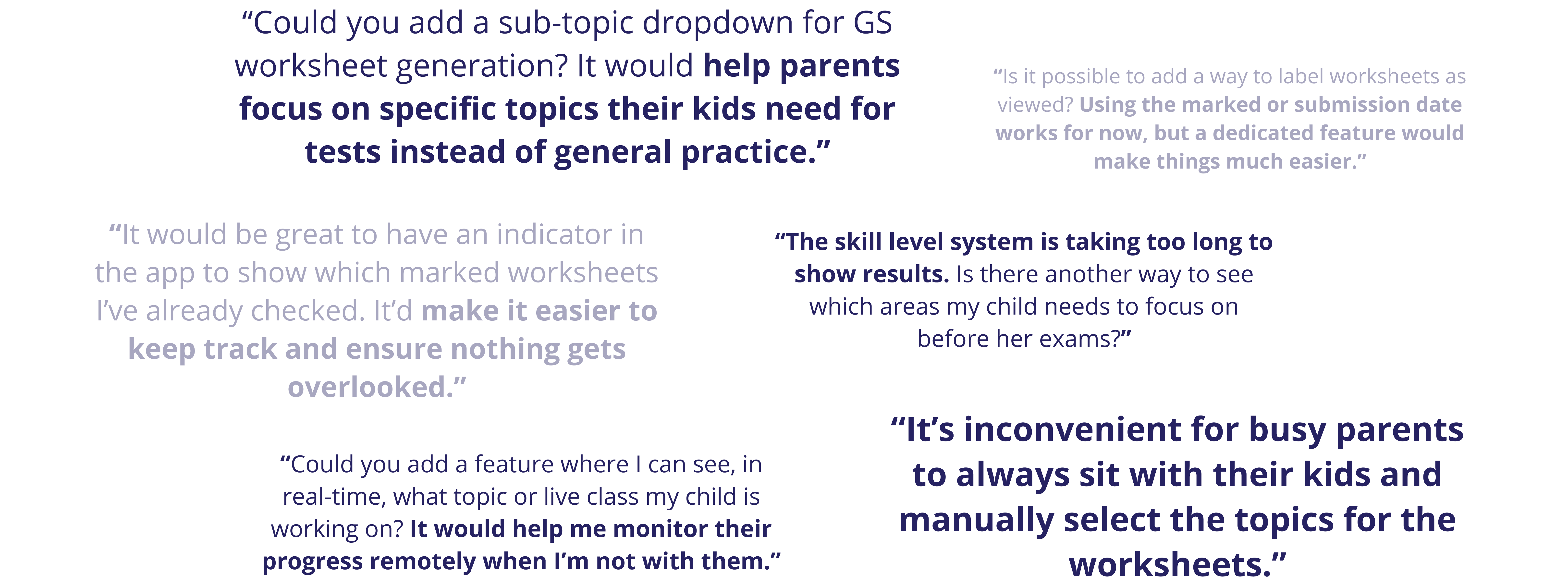
Doing this provided us with the following summary of issues:
But this wasn’t enough. Beyond reviewing feedback from our own app, we wanted to broaden our perspective by exploring how other apps present data through analytics. Since the Parent App’s primary goal is to provide parents with meaningful insights about their children, we focused on apps that excel at delivering complex information in a clear and cohesive way—even if they weren’t specifically designed for parents. To do this, we conducted market research and gathered references from a variety of sources.

When we felt confident moving forward, we started defining our goals more clearly:
In a company with many interconnected moving parts and everyone invested in different aspects, it was crucial for us to understand not only our users but also how our design decisions would impact various teams. To address this, we involved stakeholders early in the process, using wireframes to visualize our solution before committing resources to a full prototype.

And finally got to work on creating our new app flow:

I thoroughly explored all possibilities, documenting the pros and cons of each option to ensure I could justify my decisions. My goal was to make sure that when I presented the options to my managers, I could confidently explain not just what I chose, but why—and why other options didn’t make the cut. After narrowing it down to three main options, we worked together to pick the best one.
That final app flow became the centerpiece of our presentation to stakeholders across different departments.

We received a lot of positive feedback on the designs and proposed changes, which included many long-requested features. However, the meeting also brought to light additional feedback, concerns, and new considerations from other departments that we had previously overlooked.
With stakeholders' approval and support for the new Parent App direction and the prioritized features to focus on, I began creating higher-fidelity prototypes while adapting the Student App design system for the Parent App. These tasks were carried out in parallel to maximize efficiency.
Instead of starting from scratch, doing this was not only more efficient, but also helped maintain brand consistency between the two products. However, it was still important to ensure they remained distinguishable, as the Student App had a more playful, child-focused design, while the Parent App needed to feel more mature. I proposed several design directions and worked closely with my Design Manager to finalize the best approach.

Focusing on the "Worksheet" and "Classes" tabs, I created a new low-fidelity prototype based on the feedback received. Within this process, I also explored various component designs individually, ensuring each element was carefully considered and refined.

After gaining approval for the design system and low-fidelity prototype, as well as integrating additional feedback from key stakeholders, I brought everything together to create our first high-fidelity prototype. One significant piece of feedback was the request to include a new "Create Worksheet" flow in the design sprint. Although it had been less of a focus earlier, I ensured it was seamlessly incorporated into this iteration.

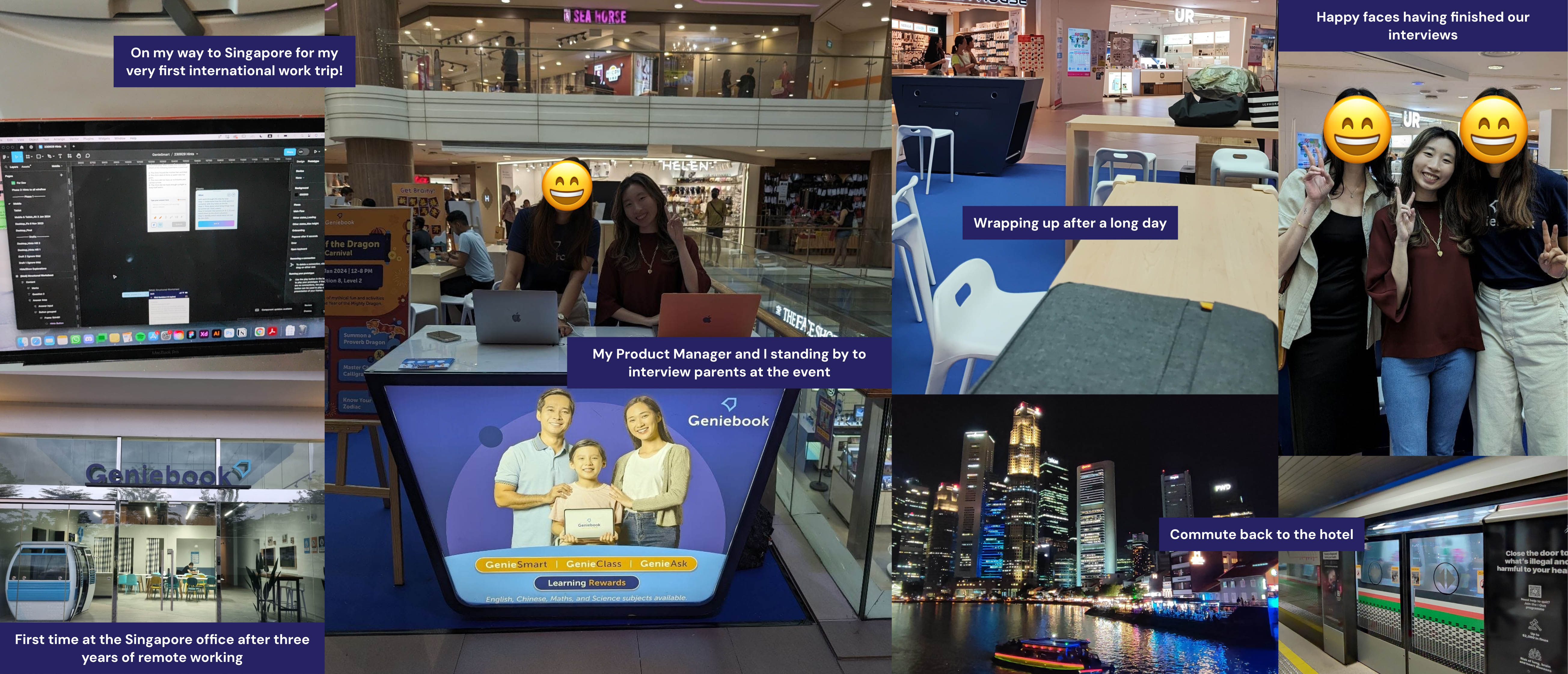
We used the first iteration of the high-fidelity prototype to test the design with real parents through semi-structured interviews. These interviews focused on exploring parents' behavior and gathering first impressions of the new design. The results were promising, with positive feedback that boosted our confidence in the direction the new Parent App was heading.
Finally, the new Parent App design brought everything together, with major updates to the "Worksheets" and "Classes" tabs, which were the primary focus of our efforts throughout the project. Alongside these, I also worked reskinning the "Progress" and "Account" tabs, which, while less extensive, were still important to ensure a cohesive user experience. This version also includes a placeholder "Referral" tab, set to be replaced by the "Dashboard" in a future update.

1.
Redesigned the top nav bar to include the page title and student image for signposting purposes.
2.
Large CTA button with clear labelling.
3.
Used left and right chevrons to indicate user's ability to swipe left and right to different time periods.
4.
Y-axis label is added for clarity. Furthermore, a stacked bar graph representing not only correct and incorrect answers, but also those which are still being marked so parents are aware of any data delays.
5.
Removed "Topics" from previous iteration in respond to new parent feedback.
6.
Combined "Worksheets" & "Attempts" tabs into a single tab.
7.
Available "Revision Worksheets" are immediately shown on top of the "Worksheet Catalogue" without having to click into "Create Worksheet," making it more accessible.
8.
Read/unread indicators are added to "Completed/Expired" worksheets for easier tracking.
9.
Card design adapted from the Student App to maintain consistency between the two related products.

10.
Replaced pop-up display with a new page as it includes more complex interactions.
11.
New "Recommended" section to reduce cognitive load of parents having to make decisions.
12.
Updated card design to fit better with the minimalistic Parent App aesthetic.
13.
Replaced "clicking into topic" action with checkbox for easier access.
14.
New sorting feature based on student's skill level.
15.
Up and down arrows to indicate increasing and decreasing progress.
16.
Read/unread indicators are added to "Completed/Expired" worksheets for easier tracking.

17.
Added a new collapsible "Worksheet Information" section to provide context.
18.
Added teacher marking status, similar to the Student App, to create transparency regarding the marking process.
19.
Redesigned card layout for consistency with the student app and better clarity of information. Additionally, "Show more" button allows for progressive disclosure to prevent parents from being overwhelmed.
20.
Removed the pie chart and replaced them with easy-to-understand numbers.
21.
Removed cohort data information on "Attempts" - keeping them only on the topical level for better relevance.
22.
Included number of questions information which was only previously available on the parent page.
23.
Topics are now clickable and will lead users to existing "Topic detail" page.
24.
Answers are now immediately available, and Mistakes filter is added.


25.
Live class attendance status to allow tracking in real time
26.
Parents are able to schedule reminders by toggling the bell icon
27.
New "Class History" section to keep track of past performance
28.
Added "Class participation" information to show whether child participated actively or did not attend the class.
29.
New "Class" tab (it was previously hidden udner the "Account" tab).
30.
Resized text for better readibility.
31.
Added a clickable info button to help parents understand more about the calculation mechanics of "Skill Levels."
32.
Added chevron to prompt users to click into Topics and see Topic details.


32.
Relocated the "Award Bubble" function outside for easier and instant access.
33.
Added sections and menu icons to standardize with Student App.

What I learnt, what I would have done differently, and where I go from here.
I learned through this project that decision-making involves navigating a variety of perspectives, each with its own priorities and trade-offs. As designers, our role is to strike a balance, knowing which sacrifices to make to create a solution that works for everyone. It’s not just about understanding users but also internal stakeholders and how each decision impacts the bigger picture.
As designers, it’s a given that we must communicate effectively through our designs—for instance, using a down chevron to signal that content is clickable. However, this project taught me that it’s equally important to communicate about the design. In a company setting, this means clearly articulating our intentions to stakeholders, collaborating with developers to ensure they understand our vision, and aligning with others involved in the process. Clear communication ensures ideas are understood and executed effectively.
I left this project just before launch, while assisting with bug fixes. If I had stayed through completion, I would have prioritized extended testing to evaluate the new designs' impact on renewal and usage rates, ensuring their long-term effectiveness.


